Excited to announce that pre-orders are now being taken for LaunchCuts at a price of $7.99. It will be available for purchase and download on January 8, 2020.
People will benefit greatly from the sorting, filtering, and organizational capabilities that #LaunchCuts brings to Shortcuts.
In my humble opinion the price point is too high for what the app actually offers, which is a custom interface to execute Shortcuts.
Compared to the $9.99 that an app like Things 3 costs this seems very high for an interface play.
$2.99-4.99 seems like a more appropriate price for a small tool like this.
Also can something be done about the icon? If the app is supposed to be a dynamic launcher for Shortcuts it would make sense to place it on the main Homescreen, but the icon makes me want to hide it on the second page of a folder.
I think the price point is good for me. I don’t want a long scrolling list of Shortcuts and I need some way to organize my shortcuts into groups. If you use Shortcuts a lot, this sounds like a pittance.
I have Keyboard Maestro on my Mac and love the ability to create palettes holding my macros. This sounds like a great way to emulate my palettes on my iPad.
I’m actually looking forward to creating a group for my End-Of-The-Day GTD shutdown routine. I group my shortcuts into this folder and go down the list.
There is a TestFlight to try out.
In my workflow, $9.99 to improve my life and Shortcuts? Heck yeah!
I agree. If the tool will be useful for me as an active Shortcuts user this is a completely reasonable price. Having been on the beta for a couple of weeks there is no question it will be a valuable tool. The app is feature rich and thoughtfully designed.
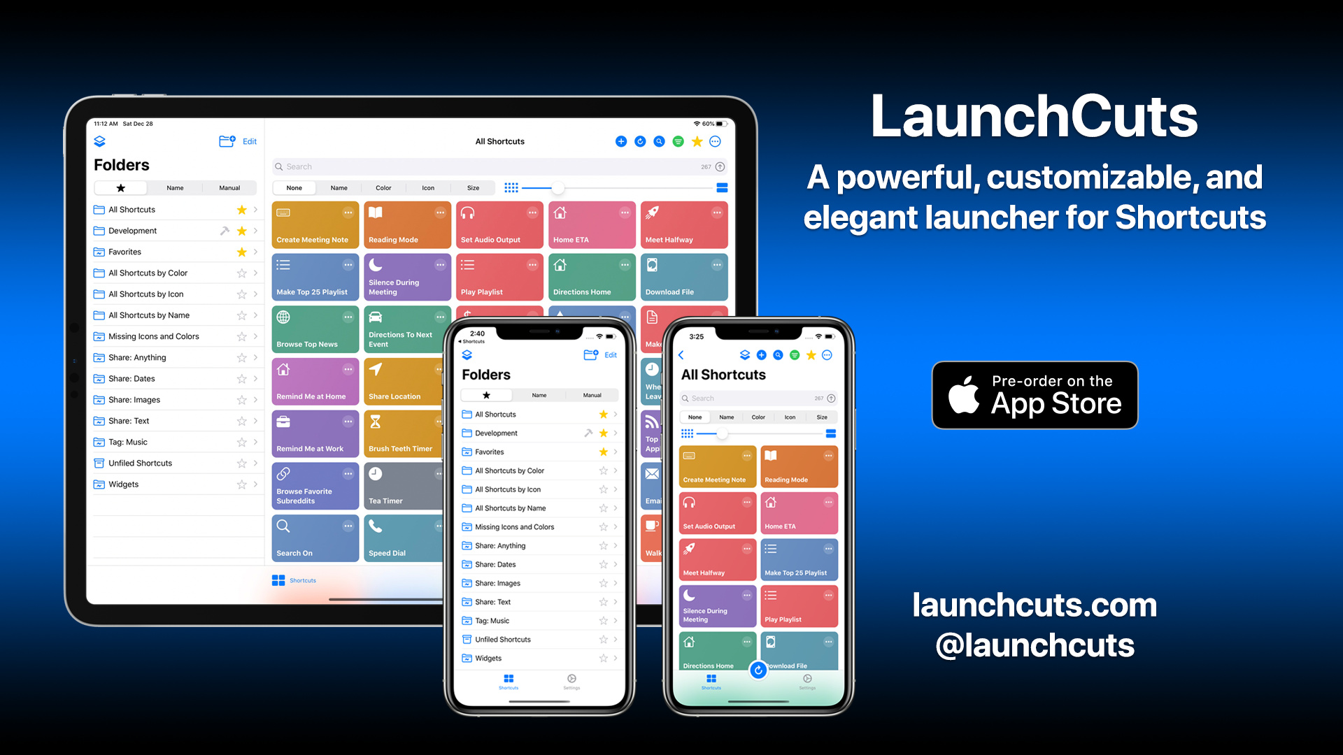
Regarding the app icon, I took cues from the Maps, Kindle, and Amazon Drive icons; I especially like how they took advantage of negative space and the squircle icon shape. If you look closely, the three cards of the LaunchCuts icons form the letters “LC” Which stands for LaunchCuts.
My planned roadmap for LaunchCuts is exciting: Today widget, Share Sheet extension, custom Shortcut actions, and more. These will be added at no extra cost in the future. So, your one-time fee gets you the app today and the app tomorrow (read: no subscriptions).
I feel that if you are using an app several times a day, every day, it’s worth paying a small premium over an app that you buy and only use occasionally.
Great to hear that LaunchCuts is launching on January 8, 2020!
Having spent some time with the beta, it was a no-brainer to pre-order the app. It’s a very slick app that solves my biggest challenge with Shortcuts…keeping my Shortcuts organized in a meaningful way. It’s worth every penny (and then some) in my book.
Honestly, I do not see much resemblance to the clean icon style of Amazon Drive. The background of the Kindle icon could also need a remake and I’m not sure if the always noisy Maps icon is a good choice to get inspiration from.
Really clean looking icons that surprised me in the last years are:
Pushcuts (very elegant play on the Shortcuts app’s color scheme with enough visual differentiation),
Luma Fusion (matches the name very well, flashy colors, simple),
ProCreate (elegantly matching),
DayOne (clean and flat revamp of the old icon),
Scriptable (elegant color scheme, minimalist),
DeeDay (colorful, balanced, yet very engaging),
twttr beta app (bold move to just use the brand color without any iconography),
even the HomeRun/HomeCam/HomeScan/HomePass set of apps is interesting, despite just consisting of a well-chosen color and base-icon + glyph.
In some way also the high fidelity icons of:
Launch Center Pro’s alternate icon (elegant gradients, high detail vector art),
Jayson (high detail vector art, playful),
Data Jar (high detail vector art, playful),
Bobby (clean vector art with balanced gradients)
and Bear (clean silhouette).
For LaunchCuts the dark circular gradient that was quickly thrown on top of the blue background with either reduced opacity or the use of blending modes is unpleasing, as it is in the center of the icon and draws too much attention.
The colors of the cards do neither match the bright color scheme that LC offers, nor the original Shortcuts ones.
I like the stylized dot in the top right corner of the red card that resembles the “…”-button to edit or play-button to run a shortcut. However, the position on the blue card is off, which feels wrong, as it is contradicting the pattern recognition from the red card. The same goes for the height to width ratio of the green card. Generally, the icon comes across as noisy and unbalanced in regards to shapes and colors.
A big issue is that the center is basically left blank, besides the gradient that actually catches attention, but shouldn’t. This is neither the case for Maps, Kindle nor Amazon Drive.
Recognizing the initials of the app in the icon is pretty far fetched.
This also goes for the very saturated black-blue-black gradient that is used for the app screenshots and videos. Making it more subtle would draw less attention to it.
I know the name finding ordeal and all its limitations (are social media accounts and domains available etc.) very well and also know that choosing a design to base a brand on is a difficult task. It’s my profession.
Two ideas that came to my mind:
Something that always draws attention is the clean look of a color-sorted Shortcut list or Today Widget (see Chris Lawley and Matthew Cassinelli). A play with a highly stylized color fan or a stack of Shortcut cards (with the dot) similar to the wallet app, all neatly color-sorted would be fitting and convey one of the main features of LaunchCuts.
A play on the “cuts” part of the name, as this clearly is part of your branding (ActionCuts, AutoCuts, WatchCuts etc.). I am not thinking of a “Fruit Ninja” style icon, but something that uses a slant and separation could work to emphasize the name. The app “Motion Stills” does it in a very (maybe too) minimal way. Also, the original Shortcut app icon plays with this in conjunction with using gradients and transparency to show interlinking squircle shapes.
Some apps offer multiple app icons and this could be something added into a later release. It doesn’t functionally affect the app and so I would think that is not a deal breaker for the overwhelming majority of the users who would no doubt be drawn to the functionality of the app at launch.
In the interim, using a home screen saved shortcut, with an icon of choice/own design, that opens the LaunchCuts app would be slightly slower, but provides a workaround for those who particularly value home screen styling. This choice of course comes done to the individual’s assessment for the balance of functionality vs. icon aesthetics, but it offers an almost limitless choice of icon.
Yes, but Things has a vastly larger potential customer base than a tool that builds on Shortcuts does.
(Not to mention that Things also sells their iPad and iPhone apps separately, which increases the overall cost.)
Realizing that most developers who aren’t going the subscription route are probably going to end up providing a year or two of updates for free, $8 is probably barely sustainable.
One feature that would make me use it more often than in the beta would be to be able to save quick-links to certain (smart)folders in LC to the Homescreen.
Sure a Shortcut action to jump to a (smart)folder donated by LC would do the trick, but then you’ll have to take the annoying detour via the Shortcut app each time.
It would be great to circumvent this by LC offering a similar “save to Homescreen” interface as Shortcuts has incl. icon/color picker. Maybe integrate SF Symbols to have a large variety of icons.
It would be amazing if this would be achieved via URL-schemes, like Bear and Things offer extensively.
I saw that in the edit screen of a folder there already is a button to “Copy the Folder UUID to Clipboard”. A syntax as follows would be great:
That’s baked into the OS, which is why Shortcuts can do that as of v13. LaunchCuts is not part of the OS, so would not be able to do that. The old Workflow would be viable, but would go via Safari. Using Shortcuts actions to bridge is probably more strategic long term; but maybe favoured options on the app icon might be another channel to consider?
Well, yes, now it is part of the system. Workflow (the predecessor of Shortcuts) achieved this without system integration. It just created a bookmark link on the Homescreen with a quick detour via an in-app Safari tab. The favicon used for the created bookmark was embedded as base64, incl. the entire instructions page that explained how to “share” the bookmark to the Homescreen. The entire HTML, as well as the part that gets shared was passed via the link that was displayed in Safari as an intermediate step. Launching the Homescreen bookmark itself did not require to go through Safari each time the link was tapped. The target URL of the bookmark was directly pointed to the workflow’s URL.
I see no reason, why this shouldn’t be possible, if a icon/color picker would be integrated into LaunchCuts.
It would save the detour switching to Shortcuts just to go to a folder directly.
Long pressing the app icon and having favorites in that quick access menu would be another nice feature, but creates more friction than quick links via a Homescreen bookmark.
Also those url-schemed links could be used in other places, such as Launch Center Pro or used in the notes area of things projects etc.
URL schemes surely are worth a thought and still have their place besides Shortcut actions and Siri intents. I never saw it as a replacement.
As it happens I was aware of the technical details of how it worked having use the data URI construct many time in the past, and I did mention the old Workflow method in my response above. But I gave that as a comparison to the current Shortcuts method you referred to, and to the point you made about detouring via Shortcuts - another example of an additional step.
In terms of URL schemes, I also agree they have their place, but Apple have publicly indicated their preference to move away from them due to security concerns. This was a key driver to a number of third party integration options in the latest OS release.
Both Shortcuts and URL scheme (ideally with x-callback-url support) would be great, but if time can only be spent on one, then the logical choice would be the Shortcuts integration.
FWIW, I did actually feedback on this area of integration during the beta to Adam.
Yes, I considered adding multiple app icons for the 1.0 release, along with icon color theme packs, but these were cut in favor of getting the product out on time.
Appreciate you elaborating here. I’ll keep your comments in mind when it comes to tweaking the app icon and/or providing multiple icons for users to choose from.

 on January 8, 2020!