My problem is not writing shortcuts, but utterly failing to understand / debug what they do 6 months later when I need to modify them.
I’m thinking about using a pseudo-programming language to put comments before each step that document esp. where variables are coming from, what parameters are passed, etc. And start it with a definition of any variable that being used in the shortcut. That is the only way I know to be able to reproduce what a shortcut is doing.
What do you use?
I document the pertinent details in Obsidian and link the note direct to the Shortcut with Hook so I can easily jump between them.
If there are key principles, logic, flows, these can all be documented more easily in a separate note taking tool. Comments and good naming of variables within shortcuts of course also feature.
2 Likes
I have the same problems. What’s been working for me so far is adding notes at certain steps in a shortcut to document.
3 Likes
I second Cornfed’s suggestion. When you’re editing your shortcut, do a search for “Comment,” then insert a comment to remind yourself why/how you coded it that way.
1 Like
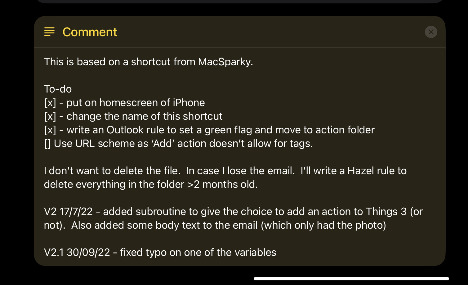
Thanks, all, for your useful insights. I’ve been using the comments action as well, typically one for every step that explains the logic, if any, plus all variables being used. For longer shortcuts, I add a header comment with ‘old-school’ variable definitions so I know what is being used for what.
1 Like
Those are pathological comments. They simply restate the actions’ own documentation, information which should already be obvious, adding clutter without adding value. Their addition suggests one of two possibilities:
-
You’re a tad OCD.
-
Shortcuts’ documentation/help system blows chunks.
I can’t answer #1, but I think #2’s right on the nose: Shortcuts’ UI is horribly deficient and scales very poorly both down (to non-technical users) and up (to programmers).
While it is possible to right-click > Show Info on a single action to view its help, this help appears as a floating bubble, obscuring actions and vanishing as soon as you try to make edits.
Here’s a fine example of Shortcuts incompetence in action:
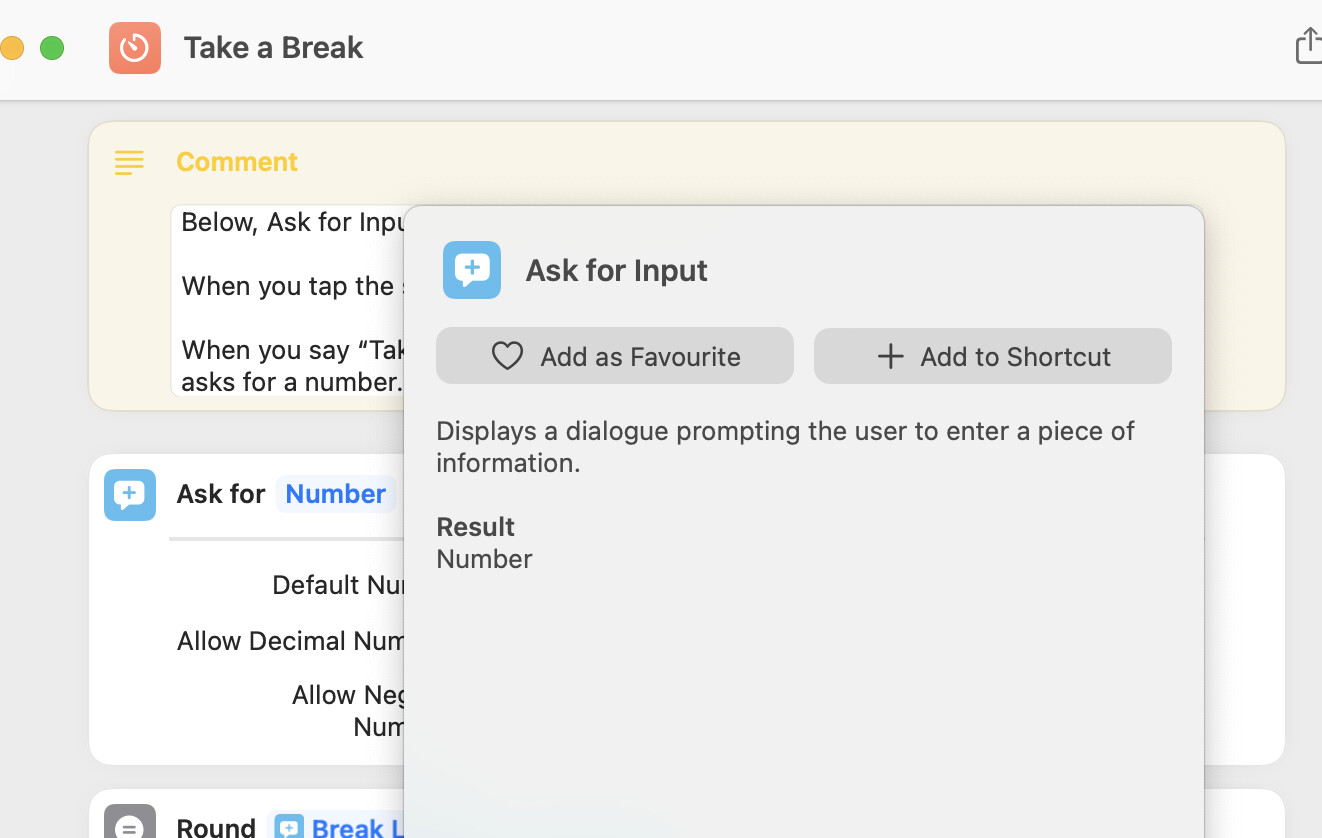
I right-clicked on the Ask for… action’s icon to bring up its documentation to help me edit its fields. Let’s count the UI/UX fails:
-
The docs obscure the very action I am trying to understand! It wouldn’t be so bad if the help was done in the style of classic Mac OS 8 help bubbles, where hovering over a GUI control (text field, checkbox, menu, etc) would flash up a compact tooltip for just that control, but this bubble is enormous and almost entirely empty space! The only new information it offers is a short summary and the type of the action’s output. (At very least, they could’ve fitted one or two examples of use into all that empty space. A picture paints a thousand words…)
-
The action’s docs do not match the action’s UI. Heck, they don’t even show the same action name! There’s no information describing the editable fields that appear within the action’s UI, depending on which type of input you select. It does dynamically change the documentation’s Result to read “text”, “number”, etc, so clearly Shortcuts has the capacity to contextually adapt its documentation according to need; it just doesn’t do it consistently or discoverably.
It would be far more helpful if the per-action “Show More” buttons were replaced with a global slider that allows the user to reduce/increase the amount of information that is displayed across all actions: user-written documentation → that plus individual actions → that plus the editable argument fields for each action → that plus each action’s own documentation → that plus miscellaneous comments (developer notes, TODOs, etc).
With all of the information inlined, a workflow would read much more like a story: i.e. a written text document with the ability to display editable fields as inlined GUI widgets, not GUI boxes with poorly labeled GUI widgets, plus blobs of poorly discoverable text scattered randomly around.
…
That all being said, Shortcuts’ graphical UI is a bit of a red herring/evolutionary cul-de-sac, of interest to the tiny slivver of market that exists in the middle between ordinary users and programmers: power users who don’t know how to use traditional programmer languages (JavaScript, Swift, etc). For those other two audiences—the 1% who are trained developers who know and what to write code, and the 98.9% who are ordinary users who just want to get their stuff done the quickest and easiest way possible, Shortcuts’ GUI is a dreadful fit.
TBH, the only end-user UI that actually matters is the Siri voice interface, which means individual actions and sequences of actions need to be easy for users to speak (to their iDevices) and be spoken (by their iDevices). And since anything that can be spoken effectively can be typed just as easily, that brings us back round to text.
Don’t get me wrong: GUI does have its uses, but mostly as convenient user-facing forms for entering input values into a workflow via keyboard and touch/mouse devices, and outputting information in attractive readable form. For actually creating and refining end-user automations, the future has to be GPT-3 & friends. That tech is now on the cusp of becoming mainstream-accessible, learning to translate fuzzy human instructions into precise machine ones with rapidly-increasing reliability.
I expect AI-assisted automation will take off sometime this year and the instant it goes stratospheric, Shortcuts’ graphical interface will be utterly, embarrassingly, painfully, obsoleted by it. The only question then will be: will Apple be at the head of this charge, leading the change by disrupting itself, or dozing at the tail end of industry as smarter, nimbler vendors zip past?
(IMO, don’t get your hopes up. Cook is 100% a processes guy: ideal for producing immaculately-tuned global manufacturing pipelines that are the envy of the tech world, but the ultimate anti-disruptor. Pity any poor Product Manager who has to inform Tim Cook that a good chunk of their last 5 years’ work needs discarded and replaced with something new overnight. GLWT.)
…
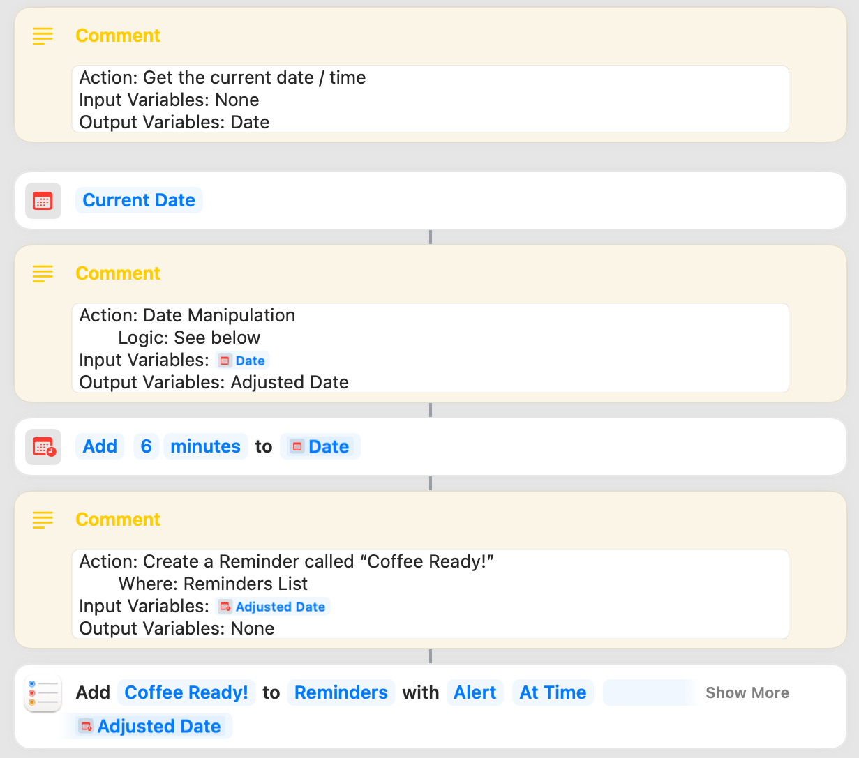
BTW, to provide an example of a useful documentation comment:
Remind me in 6 minutes’ time that my coffee is ready!
That clearly explains your original intent to users without them having to guess your thinking from examining your code. The rest is just implementation details.
I wonder how long it will be before AI can reliably translate the above sentence in both directions…