Just wanted to give a shout out to the developers of Data Jar and Charty for Shortcuts (released yesterday) who have built a couple of incredibly useful Shortcuts companion apps that work really well when used together to store and analyze data.
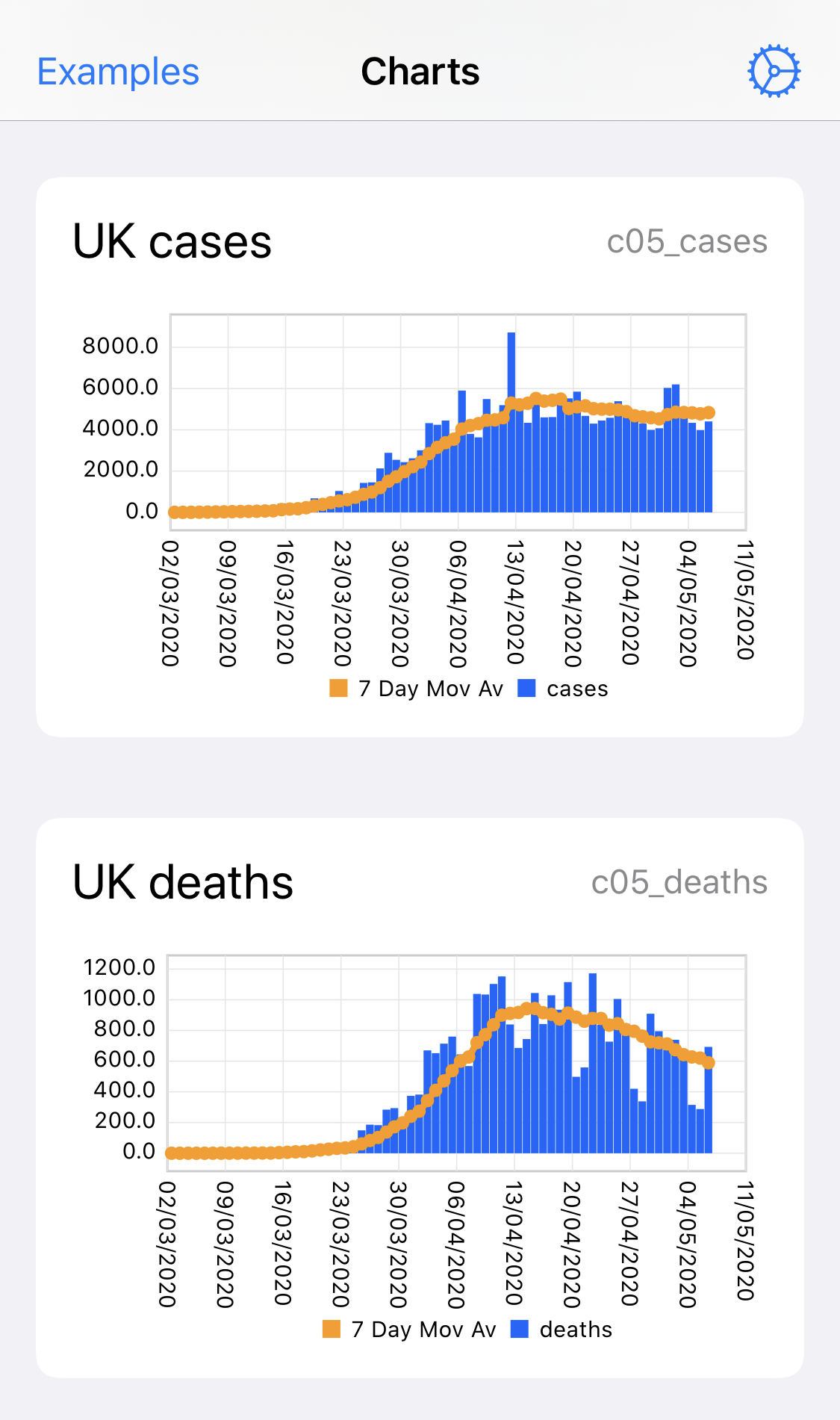
I’ve been using them during the Charty beta to analyze Covid 19 data across countries as shown below. Interested in what other applications people are finding ?
The first collects data for a specified set of countries (change the countries in the list near the top of the shortcut) from the web and writes it to Data Jar.
The second creates the charts shown above using the third to interact with Charty. Note that this does require the premium version of Charty, but it’s only a few dollars and well worth the money.
The first of these shortcuts presented some challenges as the data source used returns a single large JSON file including the data for all countries and Shortcuts is not really the best tool for manipulating such large data sets. Try doing a Repeat With Each on this data and it takes forever. Instead it uses Regular Expressions to filter and re-format the data en masse, which is much faster. Even then it was necessary to break the data into chunks for processing as RegEx can use a lot of memory and would cause Shortcuts to crash when used across the entire data set in one go. If you still see this crashing on your device then try reducing the batch size parameter in the config dictionary at the top of the shortcut.
As a matter of interest, did you calculate the rolling average yourself? I am now seeing rolling 3-day averages starting to appear but would like to be able to customise the period. Also, overlaying one week on the previous ones is instructive - as we have definite weekly cycles.
Yes, the rolling average is calculated in the third shortcut I shared and includes a parameter to configure the period.
I found that 7 days gives the best view as it smooths out daily variations (e.g. lower figures at weekends) without lagging too far behind the latest figures.
Are you seeing the crash when the Shortcut is running or is Charty just crashing immediately every time you launch it ?
If it’s the latter then I did experience this a couple of times during the beta. I think it was some kind of iCloud synchronisation issue between Charty on my iPhone and iPad, although I’m not certain.
I ended up uninstalling Charty, waiting a couple of hours then re-installing, which seemed to clear it.
I’ve not experienced this problem since installing the latest release version (1.01).
It might have something to do with syncing indeed. I found that removing charty, and reinstalling allowed me to reopen the app twice: once without the covid chart vidible, and once without, and it would then immediately crash again.
@rodrigoaraujo: thanks for the quick reply to the support email. The app now works again, once I remove all charts. But it only does that until I run these shortcuts (see above), it then immediately crashes on me again.
My apologies, I seem to have inadvertently created a stress test for these apps, which wasn’t the intention (I was trying to showcase them not break them !).
In addition to the Charty issues mentioned here, I’ve also recently had a couple of instances of Data Jar timing out when ingesting the data.
I suspect the problems may be due to the amount of data being thrown at the apps in one go and them trying to sync one batch of data to iCloud while processing the next (just a theory, but aligns with some of the observed symptoms).
I’ve re-worked the first 2 shortcuts a bit to try to alleviate this.
I’m assuming this refers to the Shortcut that fetches the data from the web and sets the values in Data Jar.
I must admit that I continued to experience intermittent issues with this, which seemed to be caused by the amount of data I was throwing at Data Jar in a short space of time
I have therefore since changed the way I approach things.
I’ve continued to store static reference data (country populations etc) in Data Jar, but am now storing the time series data for cases etc as CSV files, which can be used directly in Charty.
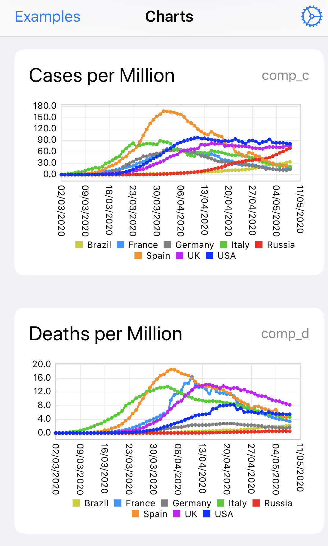
I’ve also started to make use of another app called GizmoPack, which allows you to write SQLite queries against JSON or CSV data, which makes it much simpler to extract a specific data set from information returned from the web.
I’ve uploaded a self contained example shortcut that processes country data from the web using GizmoPack (requires the GizmoPack Pro in app purchase) and then uses Charty to create the chart shown below.
A nit but I wouldn’t use markers on such a graph. (The individual data points aren’t worth marking.)
Having said that:
I don’t know if you can turn markers off.
I see two red series (and stopped looking beyond that). I don’t know if you can draw from a larger palette to avoid that. (But the markers are so small you can’t tell one series from another, legendwise.)
I keep the markers on as it allows you to spot gaps in the source data, but agree it’s clearer to turn them off if you are just looking for trends. You can turn the markers off in the Charty Style Series action at the end of the Shortcut.
The line colours used in the example are just the Charty defaults, but again you can change these in the same Style Series action.
I’ve not found a way to increase the size of the legend markers in an export so this would probably have to be one for the developer.
I have yet to get the Covid Country Data to Data Jar shortcut to run without error. It gives “Could not run SetValue” The operation took too long to complete.